Everyday, Microworkers Users access our program from a multitude of devices. Each device runs on a different platform, a different browser and has a different screen size. In order for us to deliver the best experience to everyone, both Workers and Employers, Microworkers adapted the responsive web design.
MicroWorkers Goes Responsive
Responsive web design is a design approach that lets the website adapt to the device on which they are viewed, identifies its screen resolution, then display the best possible looking page perfectly fitting the user’s screen size. There is a multitude of different screen sizes across desktops, smartphones, tablets, “phablets”, game consoles, TVs, even “wearables”. Screen sizes will always be changing, so it’s important that a site can adapt to any screen size, today or in the future. And that’s exactly what Microworkers did, forgetting about the traditional way of relying on the backend for rendering the views and instead let the front-end take over.
As illustrated in the photo below, a responsively-designed website will adjust itself to fit the dimensions of the user’s device:
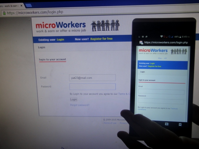
(Left) Login page from Desktop Screen; (Right) Login page from a Smartphone Screen
The image below represents the traditional PC view, while the image above highlights how the Microworkers page adapts to fit different devices.
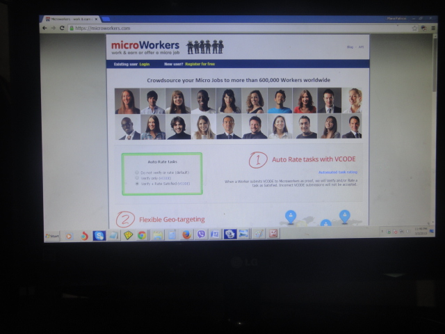
Microwoworkers Homepage from a Desktop Screen
The use of mobile devices to surf the web is growing at an astronomical pace, but unfortunately much of the web isn’t optimized for smartphones and other devices. Mobile gadgets are often constrained by display size and require a different approach to how content is laid out on screen.
Responsive web design responds to the needs of the users using fluid, proportion-based grids, flexible images, and media queries which allows the page to use different CSS style rules based on characteristics of the device it is being displayed on, most commonly the width of the browser.
Layouts of (RWD) responsive web designed pages change based on the size and capabilities of the device used. For example, on a phone, users would see content shown in a single column view while the same page may display in two columns on a tablet.
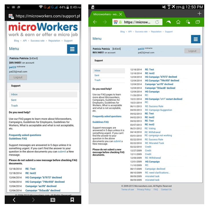
(Left) MW Support Page from a 5.5″ Smartphone Screen (Right) MW Support Page from an 8″ Tab Screen
Microworkers’ embracing the Responsive web design (RWD) can now allow optimal viewing experience, easy reading and navigation with a minimum of resizing, panning, and scrolling across its platform. How cool is that? 🙂
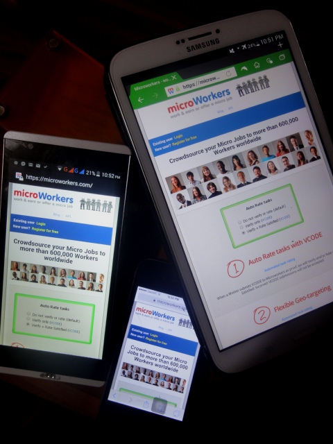
Let us check out the different views of the Microworkers page from a typical smartphone with a 5.5” screen size:
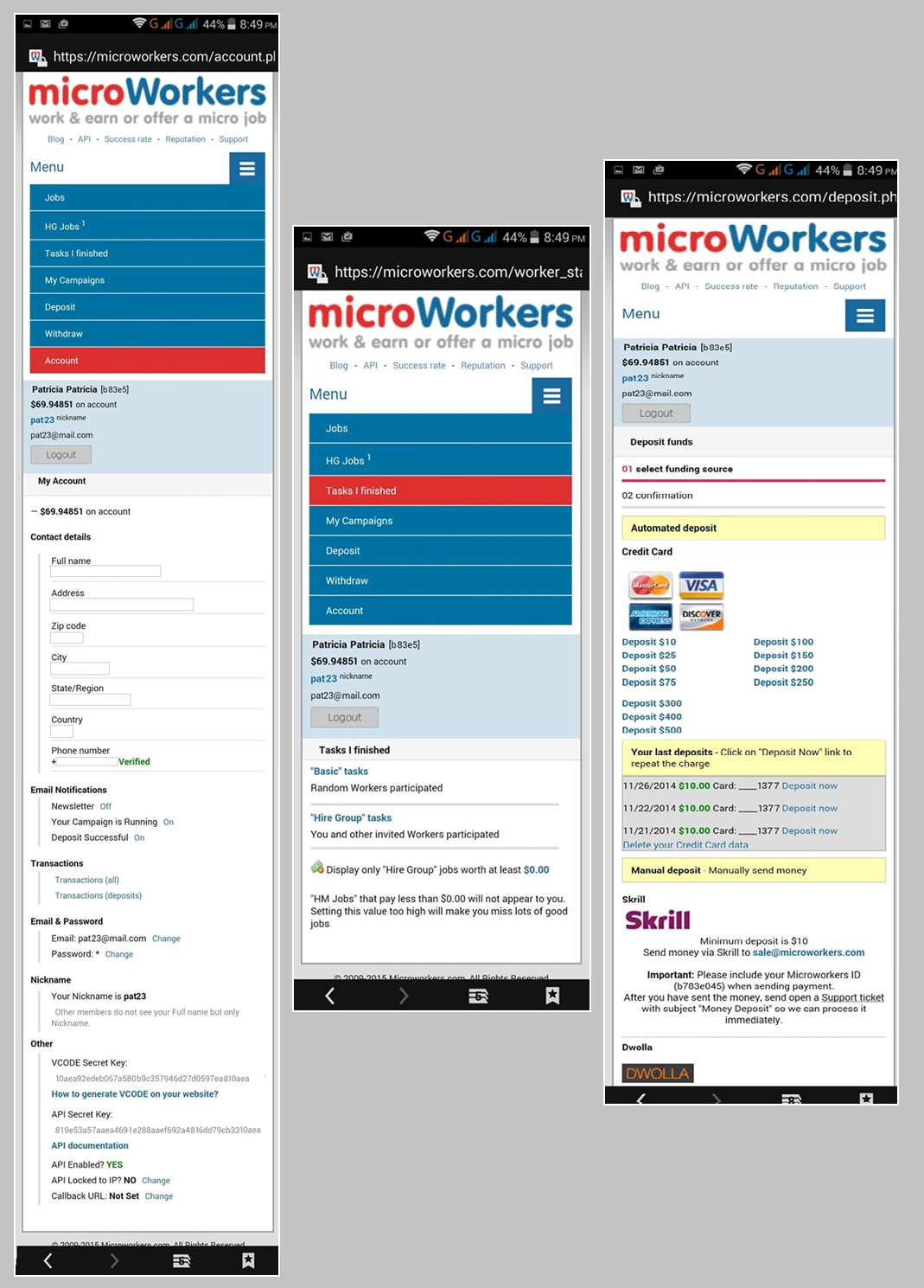
(Left) Accounts Page (Middle) Tasks Page (Right) Deposit Page
Whether you’re on a phone, tablet or any device, you may now be able to enjoy fully the features of our platform without the need to zoom in the menu items.
Next steps
We’ve almost completed new additions to our platform. Announcements on the new features will be out very soon. Stay tuned and let us know what you think about the new changes. 😉
8 Comments
It looks good but I think MW is website is loading very slowly after changing. It takes more time to reload a page. I think you will have a look on this.
Thanks
I always work on a computer, never on a phone. So I haven’t seen how your screens adapt. But the images above show an impressive effort at making the system work for all devices… Great job!
quality is first priority
The previous mobile design was comfortable to me
quality is first priority
I have submitted a task in my campaign (Basic). Its status is pending to review. Any one can explain me -What does it mean?. (I am a new employer here.)
work on a computer, never on a phone. So I haven’t seen how your screens adapt. But the images above show an impressive effort at making the system work for all
Tnx.
Your Reply